Some links on Girl Wonder Life are affiliate links. We may earn a commission if you buy through them, at no extra cost to you. Recommendations are editorial guidance, not claims of hands-on testing. Read our disclosure.
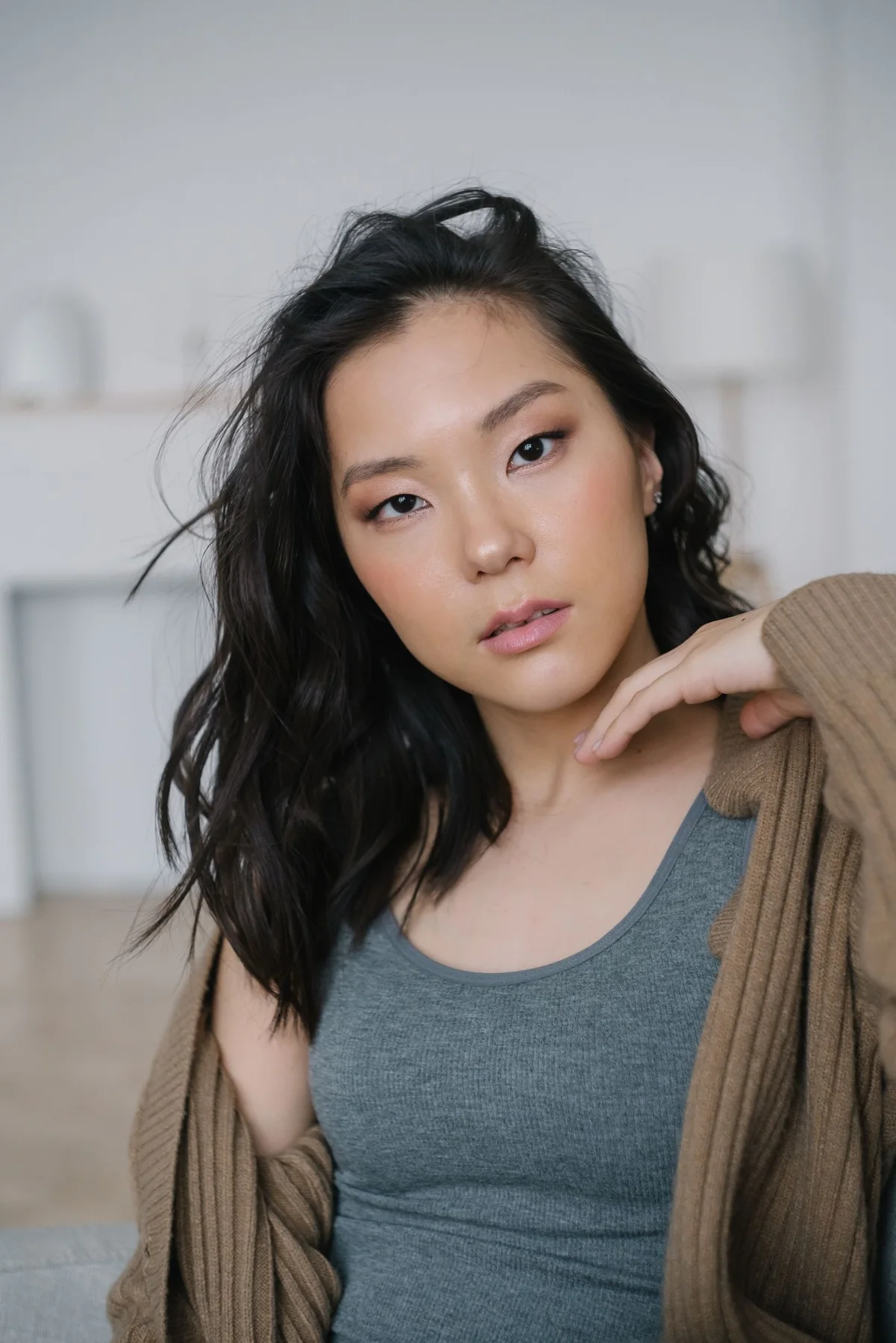
A cardigan can sit beside two neighboring colors without forming an exact match. Try the actual knit over familiar base garments and observe the visible edges. A brown cardigan beside a grey or muted warm top creates a different relationship from the same cardigan over a bright contrast. The useful question is whether you prefer those particular neighboring areas, not whether every tonal outfit must follow a fixed palette.
Keep the cardigan's arrangement steady
Use its normal supported open or fastened version for the first comparison. The opening determines how much base color remains visible. Changing that arrangement at the same time as the top can make the source of your preference harder to identify.
Let the fabric settle after ordinary movement rather than holding the fronts apart. A repeatable outfit reference should describe the version available while the hands are doing something else. Keep any actual fit or fastening concern separately visible.
Choose two base pieces with clear roles
Use familiar tops that suit the actual day and have an understood indoor purpose. One may look cooler beside the cardigan, while another introduces a warmer area. Describe what you can see rather than assigning an exact screen shade.
Keep neckline and sleeve differences in the note. If the tops also have different shapes, the comparison concerns more than color. A broader opening can change the apparent amount of the base even when the garment itself is similar in size.
Read the edges from an ordinary distance
Neighboring tones may merge quietly in a full-outfit view while remaining distinct up close. Neither effect is automatically a problem. Decide whether the cardigan should appear as a clear separate layer or part of a softer continuous upper area.
Use photographs as memory aids rather than precise color samples. Available light and screen processing can shift muted shades. Product composition and care remain with the actual garments, beyond the appearance relationship being compared.
Keep the lower outfit familiar
Use the same trousers or skirt and appropriate footwear during the first review. A dark lower area can make neighboring upper colors read as one group, while a lighter one introduces another broad section.
Leave the bag and jewelry unchanged initially. Several new details can make a quiet palette seem incomplete simply because one version received more styling. Give both actual base colors an equivalent context.
Choose the effect rather than a rule
One pairing may remain more distinct, while the other feels quieter. They can serve different real plans without competing for a permanent winner. Record the garments and the particular relationship you liked.
A tonal combination does not automatically need a contrasting scarf or new bag to become an outfit. Familiar neighboring colors can supply a complete visual choice through their own edges and amounts, leaving further contrast as a deliberate option rather than the assumed solution to every quiet arrangement.
Related reading
A Tonal Outfit with Two Different Textures, Buttoning a Cardigan for Shape without Pulling the Knit.
Notes & further reading
Our styling suggestions are editorial guidance. Check the merchant’s size chart, fabric composition, care instructions and returns policy before buying.