Some links on Girl Wonder Life are affiliate links. We may earn a commission if you buy through them, at no extra cost to you. Recommendations are editorial guidance, not claims of hands-on testing. Read our disclosure.
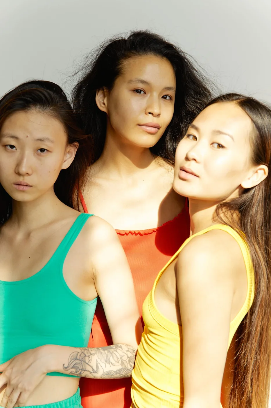
A group picture can contain several strong colours without needing a matching wardrobe. The useful question is how the large visible areas work together, not whether every person owns the same shade. Begin with the outfits people already want to wear and look at their combined colour distribution. A small comparison can give the picture a direction while preserving the individual clothes and preferences that make the group recognisable.
Choose the actual picture plan
Identify the setting, level of formality and intended audience. These facts should be understood before a colour exercise begins. A photograph for a private album and an image intended for public use need separate sharing agreement, regardless of how well the clothes coordinate.
Keep the clothing direction proportionate to the occasion. A relaxed gathering does not require a catalogue of exact products. The aim is a shared reference, not an instruction to buy something that resembles a model image.
Describe the biggest colour areas first
Use simple words for the tops, lower garments and layers likely to be visible. A green top, a red top and a yellow top can form a deliberate group without becoming a problem to solve. Small jewellery or shoe details may be less relevant than the large areas people will actually see.
Do not ask for private body photographs to make this comparison. Participants can describe their choices or share an appropriate reference voluntarily. Keep any supplied image within the audience they have agreed to.
Try the comparison against the intended background
A busy background adds its own colours and shapes. Before requesting a clothing change, consider whether a quieter permitted viewpoint would make the people clearer. If a photographer is involved, discuss the actual brief rather than distributing several competing visual instructions.
The comparison is about visible relationships, not a guarantee of a photographic result. Light, framing and the circumstances of the actual picture all contribute. An inspiration image should not become a promise that a clothing palette alone can reproduce it.
Change only one agreed variable
If the group wants a quieter direction, ask whether someone has an existing plain layer they would prefer to use. Or keep the strong tops and choose a broad level of formality as the shared connection. Avoid changing colours, garment types and accessories all at once simply because one combination is unfamiliar.
Each person should retain control of the outfit. A suggestion can be declined without requiring a private explanation. The exercise should not make one participant's wardrobe the default place where every compromise happens.
Finish with a small clear direction
Record the agreed idea in ordinary language, then stop adjusting it through successive messages. Confirm practical arrangements separately so colour discussion does not obscure where and when people need to be present.
The final picture can show different colours and still feel connected. A useful direction comes from understanding the whole frame and making a limited shared choice, leaving familiar clothes in their owners' hands rather than turning the photograph into an exact matching purchase assignment.
Related reading
Photographing Outfit Combinations for Your Own Wardrobe, Choose an Occasion Outfit With a Second Life.
Notes & further reading
Our styling suggestions are editorial guidance. Check the merchant’s size chart, fabric composition, care instructions and returns policy before buying.